Sparklines are the single most under-used feature in any Excel dashboard. The pattern is: a tiny chart inside a single cell, a value next to it, a delta in the third cell, and a colour on the row. The four uses below are the ones worth building into every report. The four tips are the ones that turn sparklines from a novelty into a habit.
The four uses
KPI tile with trend
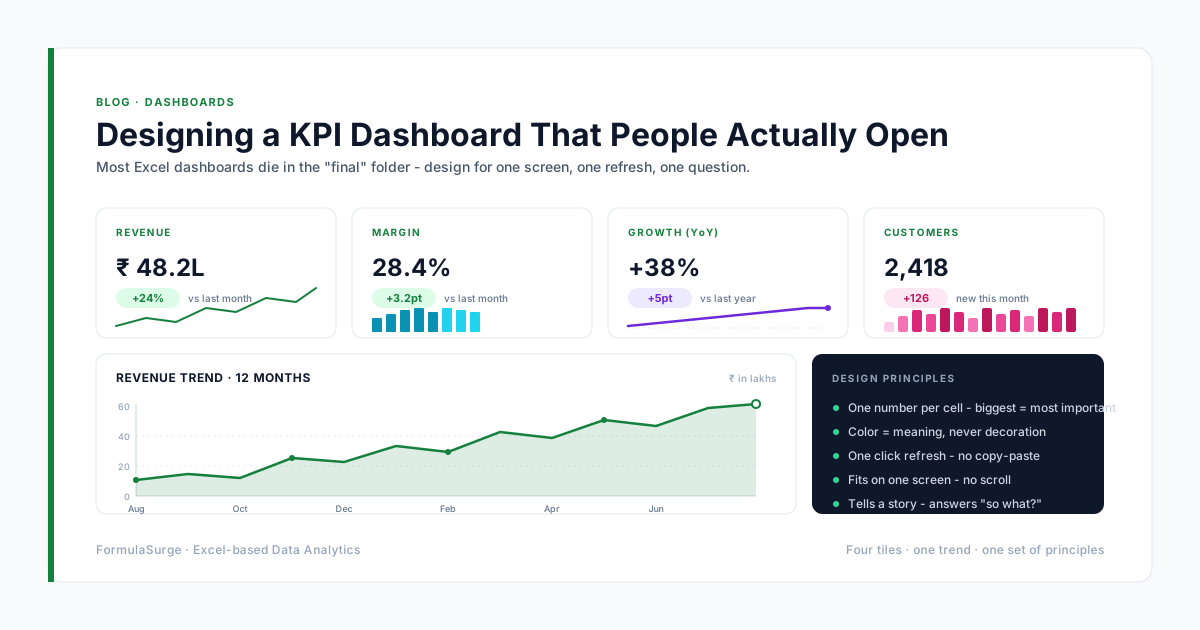
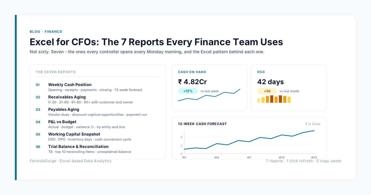
Each KPI tile on a dashboard has three elements: the value, the delta from yesterday, and the sparkline of the last 30 days. The senior uses this pattern on every CFO dashboard. The reader sees the value, the change, and the trend in a single row.
= [Value] | [Delta] | [Sparkline]
Trend column next to a table
When a table has a date column and a value column, a sparkline column next to the value column shows the trend of that row's value over time. The senior uses this pattern for SKU-level trend, customer-level trend, and product-level trend. The result: the table reads like a dashboard, not a data dump.
= [Date column] [Value column] [Sparkline column]
Win/loss binary metric
For any binary metric (paid/unpaid, won/lost, pass/fail), a win/loss sparkline shows the pattern of outcomes. The senior uses this for accounts payable ageing (paid = green, unpaid = red), customer payment history, and any status tracker. The pattern is the most underused sparkline type.
= [Day 1] [Day 2] ... [Day 30] → [Win/Loss Sparkline]
Cohort retention curve
For SaaS cohort analysis, a sparkline in each cell of the cohort matrix shows the retention curve for that cohort. The senior uses this on the cohort sheet to make the pattern visible at a glance. The full cohort matrix becomes a grid of mini-charts, each one a retention curve.
= Cohort | Month 0 | Month 1 | ... | Month 12 → [Sparkline per cohort row]
The four usage tips
Use muted colours, not bright ones
The senior uses a single muted colour (slate, gray, dark blue) for the sparkline and reserves the bright colours (green, red) for the high and low points. The sparkline is decoration; the trend is the message. A bright sparkline fights with the rest of the dashboard.
Always show the high and low
Right-click → Show High Point and Low Point. The senior always enables these. The reader sees the range of the trend in addition to the direction. A sparkline without the high and low is a half-chart.
Use column sparklines for comparison
Line sparklines show trend. Column sparklines show comparison. For metrics that are not strictly time series (revenue by product, cost by region), the senior uses column sparklines. The pattern is the same - just a different chart type.
Pair sparkline with the value
A sparkline without the value is half the story. The senior always pairs the sparkline with the value in the adjacent cell. The value is the number; the sparkline is the trend. Together, they communicate more in two cells than a full chart in ten.
From sparkline to dashboard
The sparkline is one element of a senior-built dashboard. The full pattern: a value tile, a delta tile, a sparkline tile, a chart tile, and a Slicer. The five tiles together take up one row of the dashboard. The senior ships a 5-tile dashboard for the seven CFO reports - 35 tiles total, all on one screen, all refreshed on a single click. The sparkline is what makes the tile compact; the chart is what makes the detail visible; the Slicer is what makes the dashboard interactive. The combination is the senior-built dashboard.