FormulaSurge
All articles

Article

Excel Heatmap Conditional Formatting

Excel heatmap with conditional formatting - colour scales data bars and icon sets that turn tables into visual at-a-glance maps. The patterns for cohort schedule and variance analysis.

  • heatmap
  • conditional formatting
  • color scale
  • data bars
3 min readBy
Excel Heatmap Conditional Formatting

The heatmap is the most information-dense way to present a table. The pattern is: rows for one dimension (cohort, person, cost line), columns for another (month, day, scenario), values for the metric. The colour scale encodes the value; the table structure encodes the pattern. The four patterns below are the ones the senior ships most often. The four tips are the ones that turn a heatmap from a default into a senior-built visual.

The four patterns

  • Cohort retention

    Rows = cohort month, columns = months since, values = retention %. 2-colour scale: white (low) to dark blue (high).

    The senior ships this on every SaaS engagement. The diagonal pattern is the cohort story; the dark stripes are the healthy cohorts.

  • Schedule density

    Rows = person, columns = day, values = hours scheduled. 2-colour scale: white (0 hours) to dark red (12 hours).

    The senior-built resource schedule. The reader sees over-allocation at a glance. The dark red cells are the overloaded resources; the white cells are the under-utilised.

  • Variance heatmap

    Rows = cost line, columns = month, values = variance %. 3-colour scale: red (over), white (on target), green (under).

    The senior-built variance dashboard. The reader sees the over-spend and the under-spend at a glance. The white cells are on target; the green cells are wins; the red cells are problems.

  • Customer activity

    Rows = customer, columns = month, values = revenue. 2-colour scale: white (0) to dark green (high).

    The senior-built customer activity heatmap. The reader sees the active customers and the dormant customers at a glance. The pattern is the foundation of any account-based sales motion.

The four heatmap patterns that cover 90% of visual analysis.

The four usage tips

  • Use muted colours, not bright ones

    The senior uses a muted palette: white to dark blue for positive, white to dark red for negative, white to dark green for positive, white to dark amber for warning. The default Excel colours (bright red, bright green) are too loud; the muted palette matches the dashboard theme and is easier on the eyes.

  • Use 3-colour scales for data with a midpoint

    For any data that has a meaningful midpoint (variance, growth %, score), use a 3-colour scale with white in the middle. The midpoint is the neutral; the extremes are the action. The pattern is the foundation of any variance dashboard.

  • Pair the heatmap with a data bar for magnitude

    The senior pairs a heatmap with a data bar when both distribution and magnitude matter. The colour shows the position in the range; the bar shows the absolute size. The combination is the most information-dense way to present a table.

  • Test the heatmap for colour-blind readers

    About 8% of men and 0.5% of women are colour-blind. The senior tests every heatmap by viewing it in greyscale. If the pattern is still visible, the heatmap is accessible. The fix: pair the colour with a number, an icon, or a data bar - never rely on colour alone.

The four tips that turn a heatmap into a senior-built visual.

From heatmap to dashboard

The heatmap is one element of a senior-built dashboard. The full pattern: a KPI strip, a chart strip, a heatmap in the middle, and a Slicer/Timeline at the top. The heatmap is the detail view; the KPI strip is the summary; the Slicer is the filter. The senior ships this in two to three weeks. The reader opens the dashboard, slices by region and date, and sees the pattern in the heatmap. The pattern drives the conversation in the next meeting.

Step-by-step: building a cohort retention heatmap

Six steps. (1) Lay out the cohort data: rows are cohort months, columns are months since cohort (M0, M1, M2, ...), values are retention %. (2) Select the value range. (3) Home → Conditional Formatting → Color Scales → More Rules → 2-Color Scale. (4) Set Min to "Lowest Value" with white fill. (5) Set Max to "Highest Value" with a dark blue fill. (6) Add a header row above the heatmap that names each column. The pattern is the standard for every SaaS cohort analysis and ships in under an hour from raw data.

Common pitfalls

Five pitfalls to avoid. (1) Too many colours - three is the senior's limit. Beyond three, the chart is unreadable. (2) Bright default colours - the default Excel red and green are too loud; use muted red (#fca5a5) and muted green (#86efac). (3) Colour-only encoding - colour-blind readers can't distinguish the values. Pair colour with a number, icon, or data bar. (4) Wrong midpoint - a 3-colour scale with midpoint at zero or 50% is meaningless; pick the natural midpoint of your data (variance zero, target value, expected baseline). (5) Mixing scales across rows - pick one scale and apply it consistently. The reader learns to read the chart in 30 seconds.

Conditional formatting vs custom formatting

Conditional formatting is dynamic - the colour changes when the value changes. Custom formatting is static - the colour is set once. The senior uses conditional formatting for any value that changes with data refresh (revenue, variance, score). The senior uses custom formatting only for fixed labels (red for "Critical", green for "Approved"). The confusion between the two is the most common Excel formatting mistake - a custom-formatted red cell stays red even when the value drops to zero, which misleads the reader.

Performance and limits

Conditional formatting on a 1K-row range renders in under a second. On 100K rows, expect 3-5 seconds to apply the rule. On 1M+ rows, conditional formatting slows the workbook to a crawl - switch to Power Pivot (xVelocity engine) or split the data into multiple sheets. The senior's rule: if the dataset exceeds 100K rows, store in Power Pivot and apply conditional formatting on the pivot output, not the source.

How this fits the senior-built dashboard

The heatmap is the centrepiece of every operations dashboard the senior ships - resource schedule, vendor spend, customer activity, project hours. The pattern is documented on designing a KPI dashboard and is the standard ship pattern for every operations dashboard we build in our dashboard development engagement. The heatmap is one tile; the dashboard has 5-7 tiles total. The reader slices by date and region and watches the heatmap pattern change in real time.
Free · 10 minutes · No obligation

Send us the workbook your CFO reads. We will tell you which checks fail.

We run the same seven mechanical checks on every workbook we audit. No judgement calls, no scope creep - just a written list of which numbers you should stop trusting and why. Free, in a written reply within a working day.

  • Hard-coded totals
  • Hidden rows in SUM ranges
  • Headline trace to source
  • Hard-coded assumptions
  • Correct data types
  • Reconciliation to source
  • Fresh refresh timestamp

Want an answer right now? Run the free Workbook X-ray on your file. It checks it in your browser in seconds.

checks.xlsx
Auto-runs on refresh
  1. 01No hard-coded totalsPass
  2. 02Hidden rows in SUM rangesFail
  3. 03Headline traces to sourcePass
  4. 04No hard-coded assumptionsFail
  5. 05Correct data typesPass
  6. 06Reconciled to sourcePass
  7. 07Fresh refresh timestampPass
Checks tab · 7/7Runs on every refresh
JS

Written by

Founder & Principal Consultant · FormulaSurge · 10+ years of hands-on Excel work

Senior Excel practitioner with 10+ years across Power Query, Power Pivot, VBA and financial modeling. The patterns on this page are the same ones I build into client workbooks - fixed scope, fixed price, named owner. Read the full author bio. Stuck on a formula? Get a free fix.

Free tool · 10 sec · runs in your browser

Formula Explainer

Paste any formula and read it in plain English, step by step in the order Excel calculates it.

Open the tool

Related service

Need this built for your team?

See Excel Dashboard Design - fixed price in writing, built end-to-end. Not sure of the scope? A Scoping Sprint ($99 / ₹4,999) gives you an exact quote first.

Read more

10+ years in ExcelNamed senior ownerNDA signedFixed price, in writing30-day support

Frequently asked

Questions readers ask most.

What is a heatmap in Excel?

A heatmap is a table where the value of each cell is encoded by colour. In Excel, a heatmap is built with conditional formatting colour scales - a gradient from one colour (low) to another (high) is applied to the cells. The senior uses heatmaps for any tabular data where the reader needs to see patterns at a glance - cohort analysis, schedule density, variance analysis.

How do I make a heatmap in Excel?

Select the range → Home → Conditional Formatting → Color Scales → pick a 2-colour or 3-colour scale. The senior uses 2-colour scales for one-directional data (low to high), 3-colour scales for data with a midpoint (loss to neutral to profit). The colour scale is applied automatically; no formula needed.

What is the difference between a colour scale and data bars?

A colour scale fills the cell with a colour gradient. A data bar adds a horizontal bar inside the cell, sized to the value. The senior uses colour scales for distribution and pattern, data bars for magnitude and ranking. Both are visual; the choice is aesthetic.

What are icon sets in Excel?

Icon sets are conditional formatting that adds an icon (arrow, traffic light, flag) to a cell based on the value. The senior uses traffic-light icon sets for status (red/amber/green), arrows for direction (up/down/sideways), and flags for milestones. The pattern is the cleanest way to add a visual flag to a table.

Can I use a custom colour scale in Excel?

Yes. Conditional Formatting → Color Scales → More Rules → 2-Color or 3-Color Scale. The senior customises the colours: muted red for low, white for mid, muted green for high. The default Excel colours are too bright; the senior uses a muted palette that matches the dashboard theme.

What is the best heatmap for cohort analysis?

Retention cohort. Rows = cohort month, columns = months since cohort, values = retention %. The senior uses a 2-colour scale (white to dark blue) with the high values being darkest. The dark stripe on the left is the recent cohorts; the dark stripe on the right is the long-tenured cohorts. The pattern is the foundation of every SaaS cohort analysis.

Get a Free Quote

Want this built for your team?

We deliver this kind of work for clients every week. Send your requirements, sample workbook or screenshot - we'll respond with a written scope and fixed price within one working day.

  • Written scope and fixed price before any build work starts
  • Live workbook reviews - you see progress from week one
  • Documented walkthrough and 30-day support at handover
  • Mutual NDA available
Replies within one working day, usually the same day

Calls scheduled in your timezone (UK, EU, US, UAE, APAC) · How a project works

Built for teams in

Industries and cities this work is set up for

Related

Keep reading

10 Excel Functions Every Analyst Should Know

Article

10 Excel Functions Every Analyst Should Know

Master these ten functions and 80% of your daily analysis gets faster

Read
Pivot Tables: From Raw Data to Insights

Article

Pivot Tables: From Raw Data to Insights

Turn thousands of raw Excel rows into a clear answer in under five minutes

Read
Automate Monthly Reports with Excel Macros

Article

Automate Monthly Reports with Excel Macros

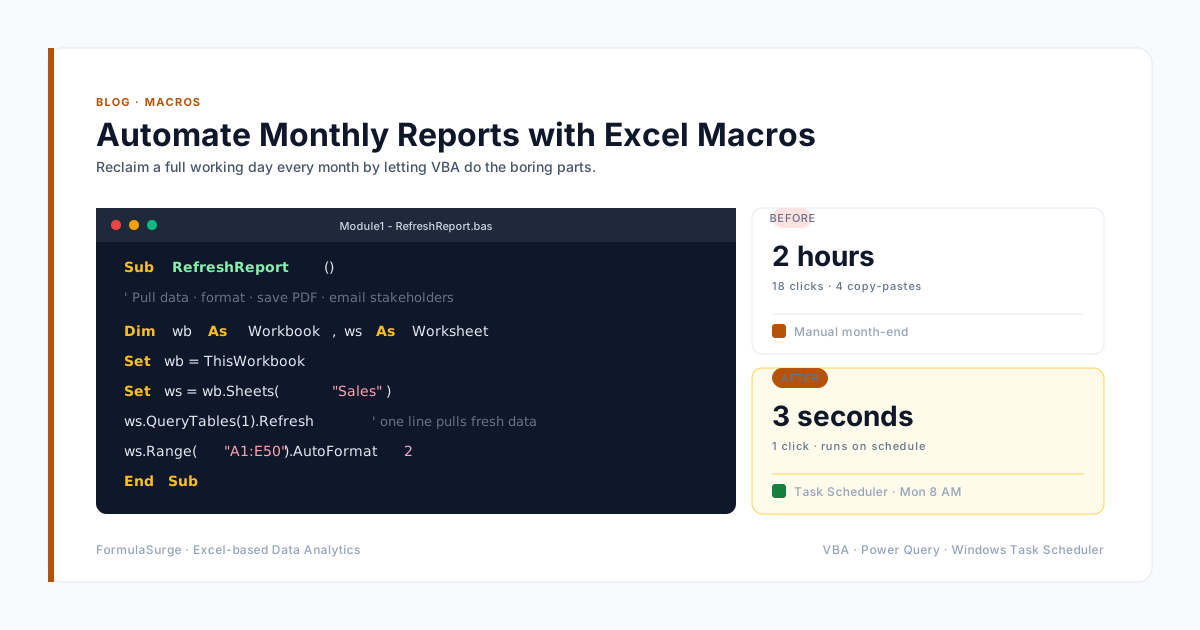
Automate monthly Excel reports with Power Query and VBA - from recurring exports and refreshes to PDF delivery. See how to make the workflow reliable, then explore our fixed-scope automation service.

Read
Excel Charts That Tell a Story

Article

Excel Charts That Tell a Story

Choose the right chart and your data explains itself

Read
Power Query: Stop Copy-Pasting From Your Inbox

Article

Power Query: Stop Copy-Pasting From Your Inbox

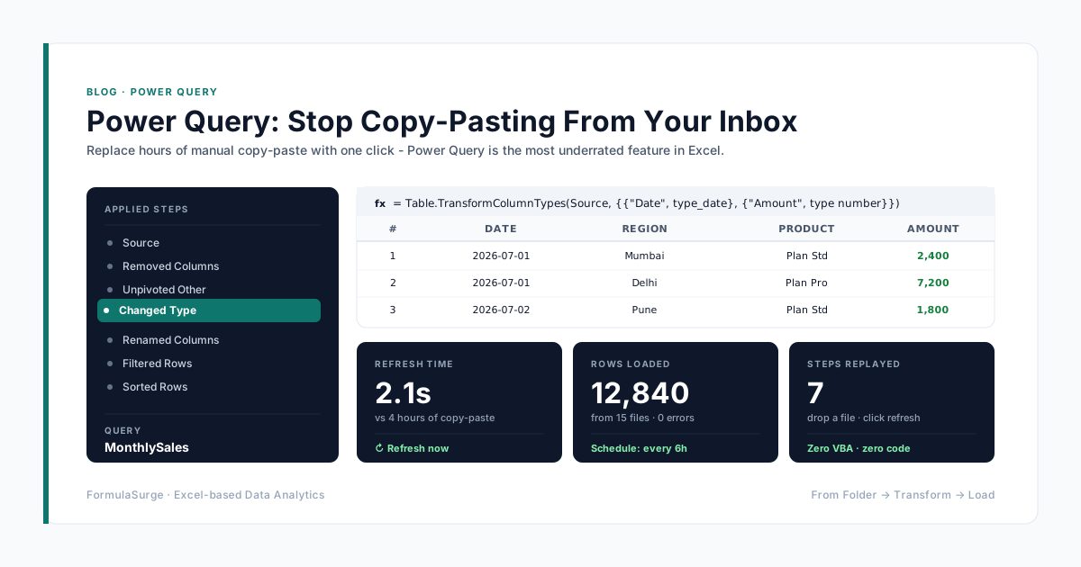
Replace hours of manual copy-paste with one click - Power Query is the most underrated feature in Excel

Read
VLOOKUP vs XLOOKUP: 7 Differences + 4 Migration Steps (2026)

Article

VLOOKUP vs XLOOKUP: 7 Differences + 4 Migration Steps (2026)

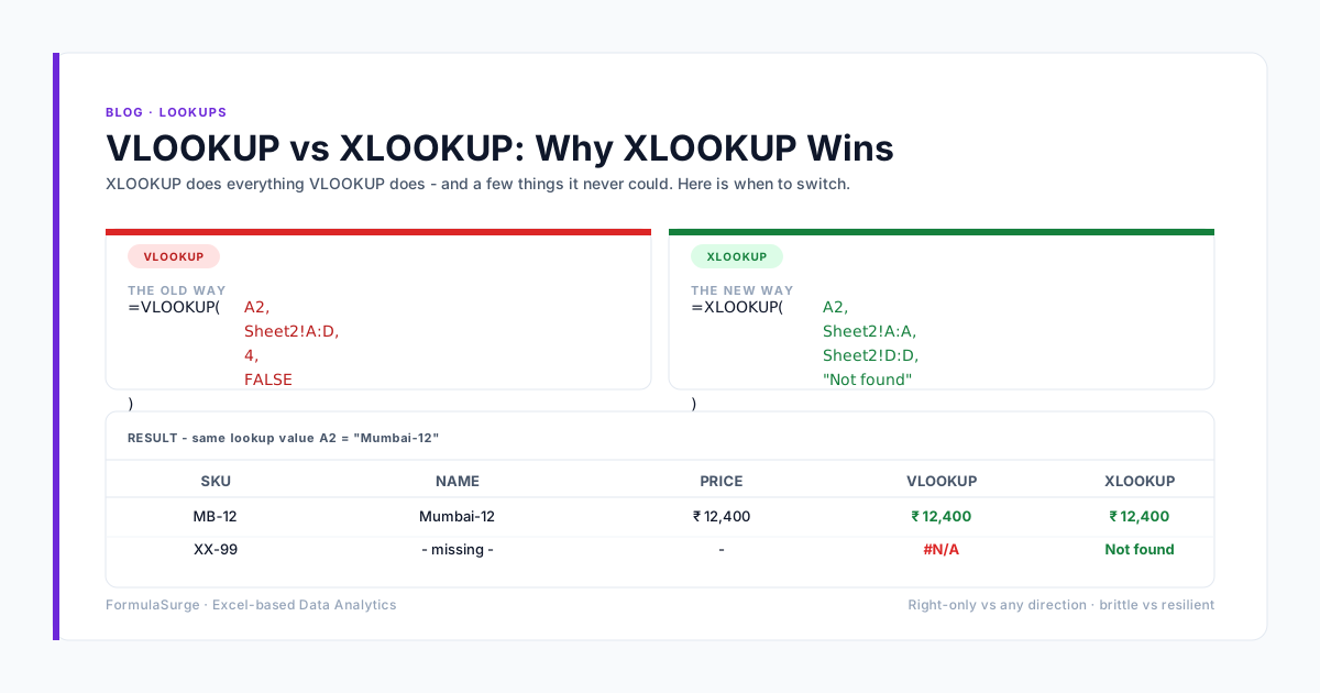
What is the difference between VLOOKUP and XLOOKUP? Side-by-side comparison with 7 concrete differences 4 migration steps 5 real examples and the one reason VLOOKUP is still useful. Updated 2026.

Read
Conditional Formatting That Actually Highlights What Matters

Article

Conditional Formatting That Actually Highlights What Matters

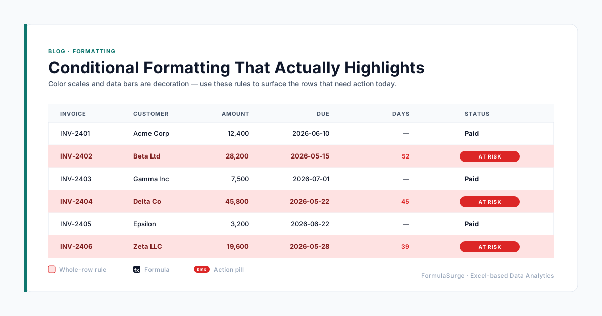
Color scales and data bars are decorative. Use these rules to surface the rows that need action today.

Read
Data Validation: Save Rules and Stop Bad Data at the Door

Article

Data Validation: Save Rules and Stop Bad Data at the Door

How to save data validation rules in Excel, copy them across sheets, and set up drop-downs with dependent lists and custom error messages.

Read
Dynamic Arrays: The Excel Feature You Didn't Know You Had

Article

Dynamic Arrays: The Excel Feature You Didn't Know You Had

FILTER SORT UNIQUE SEQUENCE and the spill range - the modern way to build reports that update themselves.

Read
Designing a KPI Dashboard That People Actually Open

Article

Designing a KPI Dashboard That People Actually Open

Most Excel dashboards die in the 'final' folder. Here is the design checklist we use so yours get opened every Monday.

Read
Excel for CFOs: 7 Reports Every Finance Team Actually Uses

Article

Excel for CFOs: 7 Reports Every Finance Team Actually Uses

A working finance team needs seven reports - not sixty. Here are the seven every controller opens every Monday morning and the Excel pattern behind each one

Read
SUMPRODUCT: 5 Jobs It Does Better Than SUMIFS (2026)

Article

SUMPRODUCT: 5 Jobs It Does Better Than SUMIFS (2026)

The mental model that makes Excel SUMPRODUCT click - 5 jobs it does better than SUMIFS COUNTIFS AVERAGEIF MAXIFS with worked examples and the 4 mistakes to avoid. Updated 2026.

Read
How to Audit a Spreadsheet in 10 Minutes (2026)

Article

How to Audit a Spreadsheet in 10 Minutes (2026)

How to audit a spreadsheet in 10 minutes - the 7-step Excel checklist that catches the common errors before the CFO signs. Updated 2026.

Read
What-If Analysis in Excel: 3 Tools + 5 Examples (2026)

Article

What-If Analysis in Excel: 3 Tools + 5 Examples (2026)

What is What-If Analysis in Excel? Goal Seek Data Tables and Scenario Manager - three built-in tools explained with 5 worked examples for sensitivity break-even and forecasting. Updated 2026.

Read
Excel File Too Slow? 7 Fixes Before You Buy a New Tool

Article

Excel File Too Slow? 7 Fixes Before You Buy a New Tool

Seven fixes in order - turn nine out of ten slow files around before you migrate to Power BI or Tableau

Read
Power Pivot for People Who Hate Power Pivot

Article

Power Pivot for People Who Hate Power Pivot

The most powerful feature in Excel. The one nobody uses. Three concepts and five DAX functions - and the architecture that turns Excel into a real data tool

Read
Excel for CA Firms: 5 Automation Wins

Article

Excel for CA Firms: 5 Automation Wins

Five high-ROI Excel automations Indian CA firms use to eliminate manual GST TDS and ledger reconciliation.

Read
Excel Dashboard for Manufacturing Plant India

Article

Excel Dashboard for Manufacturing Plant India

How to build an executive Excel manufacturing dashboard that tracks daily production yield scrap % and machine downtime.

Read
Power Query Tutorial for Indian Finance Teams

Article

Power Query Tutorial for Indian Finance Teams

Step-by-step Power Query tutorial for Indian finance teams - automate data cleaning and ledger consolidation.

Read
Excel Month-End Close: How Indian SMEs Do It Faster

Article

Excel Month-End Close: How Indian SMEs Do It Faster

How Indian SMEs reduce month-end close from 5 days to under 4 hours using structured Excel pipelines.

Read
Hire a Remote Excel Consultant from India

Article

Hire a Remote Excel Consultant from India

Why US UK EU and APAC businesses hire remote Excel consultants from India - fixed price and overlapping hours.

Read

Article

Offshore Excel Freelancer: Fixed Price vs Hourly

Why fixed-price offshore Excel projects deliver higher ROI than open-ended hourly freelance contracts.

Read
How to Work with a Remote Excel Expert

Article

How to Work with a Remote Excel Expert

A 4-step framework for working seamlessly with a remote Excel specialist on remote engagements.

Read
Excel Consultant for Small Business (US UK AU)

Article

Excel Consultant for Small Business (US UK AU)

Four ways small businesses in the US UK and Australia use custom Excel automation to save thousands.

Read
Excel Financial Model Freelancer Remote

Article

Excel Financial Model Freelancer Remote

What to demand when hiring a remote financial modeling freelancer - FAST standards 3-statement integration and audit checks.

Read
Excel SUMIFS: The Formula That Runs Finance

Article

Excel SUMIFS: The Formula That Runs Finance

Excel SUMIFS formula explained - the workhorse of any finance dashboard. Sum by date range by category by multiple criteria with AND/OR logic. Examples and pitfalls.

Read
INDEX MATCH vs VLOOKUP

Article

INDEX MATCH vs VLOOKUP

INDEX MATCH vs VLOOKUP - structural differences why INDEX MATCH is more flexible and when XLOOKUP replaces both. Examples and migration tips.

Read
Excel LET and LAMBDA Functions

Article

Excel LET and LAMBDA Functions

Excel LET and LAMBDA functions explained - named sub-expressions custom reusable functions and the modern Excel patterns that replace messy nested formulas.

Read
Excel Named Ranges Best Practices

Article

Excel Named Ranges Best Practices

Excel named ranges - best practices for naming scope and structure. The patterns that keep workbooks auditable fast and easy to hand over.

Read
Excel Tables Deep Dive

Article

Excel Tables Deep Dive

Excel Tables deep dive - structured references automatic growth total rows slicers and the patterns that turn plain ranges into auditable data blocks.

Read
Excel IFS and SWITCH

Article

Excel IFS and SWITCH

Excel IFS and SWITCH functions explained - the modern replacements for nested IF formulas. Cleaner syntax easier to read and easier to debug.

Read
Excel TEXTJOIN and CONCAT

Article

Excel TEXTJOIN and CONCAT

Excel TEXTJOIN CONCAT and the rest of the text functions - modern patterns for joining splitting formatting and cleaning text in Excel.

Read
Excel ABC Inventory Analysis

Article

Excel ABC Inventory Analysis

Excel ABC analysis for inventory - classify SKUs by revenue contribution prioritise reorder reviews and cut working capital. Excel pattern with formulas.

Read
Excel RFM Customer Analysis

Article

Excel RFM Customer Analysis

Excel RFM analysis for customer segmentation - Recency Frequency Monetary value and the patterns that drive email and sales targeting. Excel formulas and example.

Read
Excel Cohort Analysis for SaaS

Article

Excel Cohort Analysis for SaaS

Excel cohort analysis for SaaS - retention curves expansion revenue net revenue retention. The pattern that every SaaS founder needs.

Read
Excel Sensitivity Analysis

Article

Excel Sensitivity Analysis

Excel sensitivity analysis with one-input and two-input Data Tables. The pattern that every financial model needs for break-even scenario and what-if analysis.

Read
Excel Keyboard Shortcuts

Article

Excel Keyboard Shortcuts

Excel keyboard shortcuts the senior uses every day - navigation selection formula entry formatting and the hidden shortcuts that save minutes per hour.

Read
Excel for Accountants

Article

Excel for Accountants

Excel for accountants and bookkeepers - the formulas patterns and workbooks that automate the monthly close the reconciliation and the client reporting.

Read
Excel for HR and Payroll

Article

Excel for HR and Payroll

Excel for HR and payroll - the templates and patterns for attendance leave payroll and headcount reporting. India-specific examples with PF ESI and TDS.

Read
Excel for Sales Pipeline

Article

Excel for Sales Pipeline

Excel for sales pipeline and forecasting - deal stages weighted pipeline quota tracking and forecast accuracy. Excel pattern for B2B sales teams.

Read
Excel vs Google Sheets

Article

Excel vs Google Sheets

Excel vs Google Sheets in 2026 - the honest comparison. When to use each the limits of Google Sheets and the patterns that work in both.

Read
Excel vs Power BI

Article

Excel vs Power BI

Excel vs Power BI in 2026 - the honest comparison. When to use each the limits of Power BI and the patterns that work in both.

Read
Excel IRR NPV PMT

Article

Excel IRR NPV PMT

Excel IRR NPV PMT and financial functions - the patterns for valuation loan amortisation and investment analysis.

Read
Excel Sparklines

Article

Excel Sparklines

Excel sparklines - tiny charts inside a single cell. The patterns for KPI tiles trend columns and dashboard compactness.

Read
Excel Combo Charts

Article

Excel Combo Charts

Excel combo charts - bar and line on the same axis with secondary axis for the second metric. The pattern for revenue and margin sales and forecast and any two-metric dashboard.

Read
Excel Waterfall Charts

Article

Excel Waterfall Charts

Excel waterfall charts - the bridge from one number to another. How to build one from scratch the P&L bridge use case and the data layout.

Read
Excel Pivot Charts

Article

Excel Pivot Charts

Excel pivot charts - the visual layer on top of a Pivot Table. The patterns that turn 100K-row tables into one-click dashboards with Slicers and Timelines.

Read
Excel vs Python Pandas

Article

Excel vs Python Pandas

Excel vs Python Pandas in 2026 - the honest comparison. When to use each the limits of Pandas and the patterns that work in both.

Read
Excel vs Tableau

Article

Excel vs Tableau

Excel vs Tableau in 2026 - the honest comparison. When to use each the limits of Tableau and the patterns that work in both.

Read
Excel Solver for Operations Research

Article

Excel Solver for Operations Research

Excel Solver for operations research - linear programming integer programming transportation assignment and workforce scheduling. The patterns and limits.

Read
Excel Monte Carlo Simulation

Article

Excel Monte Carlo Simulation

Excel Monte Carlo simulation - NORM.INV RAND and the data table pattern that turns a deterministic model into a probabilistic one. Risk analysis in Excel.

Read
Excel FORECAST.ETS

Article

Excel FORECAST.ETS

Excel FORECAST.ETS for seasonal forecasting and FORECAST.LINEAR for trend forecasting. The patterns for sales demand and revenue forecasting.

Read
Excel Linear Regression

Article

Excel Linear Regression

Excel linear regression with SLOPE INTERCEPT TREND RSQ and LINEST. The patterns for trend analysis sensitivity and what-if.

Read
Excel for Project Management

Article

Excel for Project Management

Excel for project management - Gantt charts task trackers resource allocation and status reporting. The patterns for IT construction and consulting projects.

Read
Excel for Restaurant Operations

Article

Excel for Restaurant Operations

Excel for restaurant operations - food cost recipe costing inventory daily sales and the patterns for the modern restaurant chain.

Read
Excel for E-commerce Inventory

Article

Excel for E-commerce Inventory

Excel for e-commerce inventory - multi-channel stock sync SKU master reorder point dead stock and the patterns for the modern D2C brand.

Read
Excel Templates vs Workbooks

Article

Excel Templates vs Workbooks

Excel templates vs workbooks - when to use each the .xltx file format the .xlsx runtime and the patterns for shippable Excel deliverables.

Read
Excel VBA vs Power Query

Article

Excel VBA vs Power Query

Excel VBA vs Power Query - when to use each the limits of VBA and the modern pattern that combines both. The senior-built automation stack.

Read
Excel Protect Sheet

Article

Excel Protect Sheet

Excel Protect Sheet and Protect Workbook - the patterns for locking formulas allowing user input and securing the workbook structure.

Read
Excel Error Handling with IFERROR

Article

Excel Error Handling with IFERROR

Excel error handling with IFERROR and IFNA - the modern pattern that turns #N/A #VALUE! #REF! and #DIV/0! into clean messages.

Read
Excel COPILOT Function Removed: Fix the #NAME? Errors

Article

Excel COPILOT Function Removed: Fix the #NAME? Errors

Microsoft removed the COPILOT worksheet function on 14 September 2026. How to find affected cells, keep the cached results and move to the Copilot pane.

Read
Excel REGEX Functions: REGEXTEST, REGEXEXTRACT, REGEXREPLACE

Article

Excel REGEX Functions: REGEXTEST, REGEXEXTRACT, REGEXREPLACE

Excel's three regex functions with worked examples - validate a GSTIN, extract emails, strip phone numbers - and the compatibility check before sharing.

Read
Excel TRIMRANGE and Trim References (A:.A) Explained

Article

Excel TRIMRANGE and Trim References (A:.A) Explained

TRIMRANGE and the trim-reference operators cut blank rows off range edges - syntax, examples and the mismatched-size trap.

Read
Excel GROUPBY and PIVOTBY: Pivot Tables as Formulas

Article

Excel GROUPBY and PIVOTBY: Pivot Tables as Formulas

GROUPBY and PIVOTBY build a summary table with one formula that recalculates on its own - syntax, five finance examples and what to check before replacing a PivotTable.

Read
Excel IMPORTCSV and IMPORTTEXT: Load a File With One Formula

Article

Excel IMPORTCSV and IMPORTTEXT: Load a File With One Formula

IMPORTCSV and IMPORTTEXT load a CSV or text file into a dynamic array with one formula - syntax, examples and why they are not ready for shared reports yet.

Read

Reading norms

How every article on this blog is written.

Same six rules on every post - from the first 10-functions article to the latest CFO report pattern. The writing matches the work.