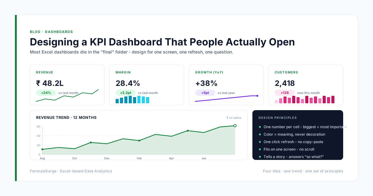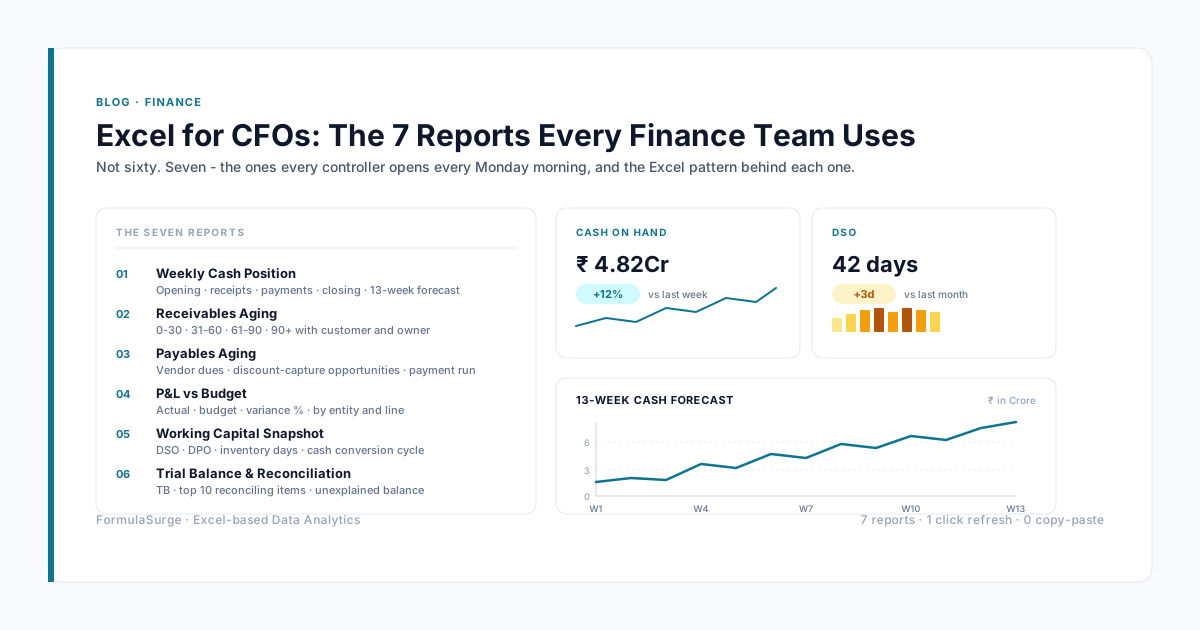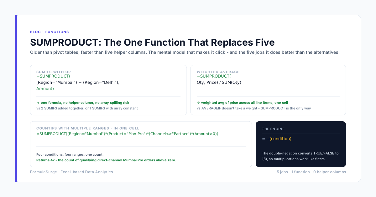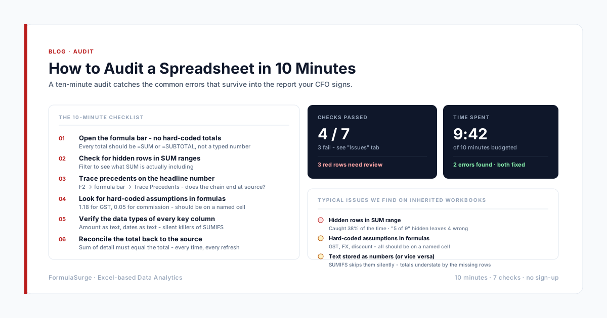
The pivot chart is the foundation of every interactive Excel dashboard. The pattern is: Pivot Table on the data tab, pivot chart on the dashboard tab, Slicers and Timelines for filtering. The four patterns below are the ones the senior ships most often. The four tips are the ones that turn a pivot chart from a default into a senior-built interactive dashboard.
The four patterns
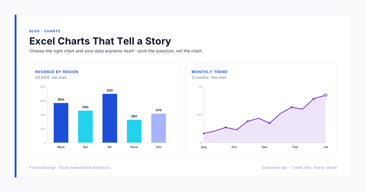
Revenue by region with Slicer
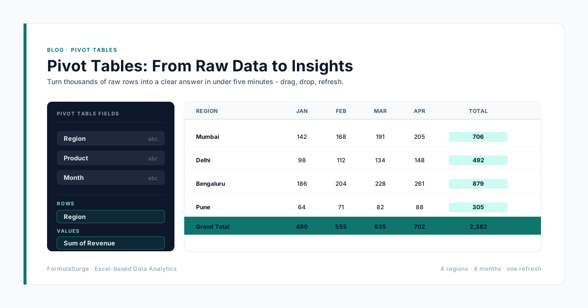
Pivot Table: rows = region, values = sum of revenue. Pivot Chart: column chart. Slicer: product line. Timeline: month.
The senior-built sales dashboard. The reader slices by product line and date, the chart updates in real time. The whole dashboard is one screen, one Slicer, one Timeline.
Top 10 customers with detail
Pivot Table: rows = customer (filtered to top 10 by value), values = sum of revenue. Pivot Chart: horizontal bar. Slicer: industry, region.
The senior-built customer dashboard. The reader sees the top 10 customers, filters by industry or region, drills into the detail. The pattern is the foundation of any account-based sales motion.
Monthly trend with comparison
Pivot Table: rows = month, columns = year, values = sum of revenue. Pivot Chart: line chart with two series (current year, prior year).
The senior-built trend dashboard. The reader sees the month-by-month trend with the prior year for comparison. The pattern answers: are we growing year-over-year, and where?
Variance by category
Pivot Table: rows = category, values = sum of actual, sum of budget, sum of variance. Pivot Chart: column chart with actual and budget side by side.
The senior-built variance dashboard. The reader sees actual vs budget by category. The combination with the conditional formatting on the variance cell makes the over-/under-spend visible at a glance.
The four usage tips
Always pair pivot chart with Slicers
A pivot chart without Slicers is a static chart. A pivot chart with Slicers is an interactive dashboard. The senior always adds Slicers - by date, by category, by region. The reader can answer their own question in two clicks.
Use Timelines for date filters
The Timeline is the cleanest way to filter a pivot chart by date. The senior uses Timelines on every chart that has a date dimension. The Timeline is bigger than a Slicer and shows the date range, which is what the reader actually needs.
Keep the chart type simple
Column, line, bar, pie. The senior uses four chart types in 90% of dashboards. Beyond four, the chart is unreadable. The chart type is the message - column for comparison, line for trend, bar for ranking, pie for share.
Hide field buttons on the chart
PivotChart Analyze → Field Buttons → Hide All. The field buttons are clutter; the senior hides them. The reader sees the chart and the Slicers, not the field buttons.
From pivot chart to senior dashboard
The senior-built dashboard is a single tab with: a one-page title, a date range, a Slicer bar (region, product, customer segment), a Timeline (date), a 5-tile KPI strip, a chart strip (revenue, margin, customers, production, cash), and a detail Pivot Table at the bottom. The whole dashboard fits on one screen. The refresh is on demand or on schedule. The Slicers filter everything. The senior ships this in two to three weeks and the team operates it for years.